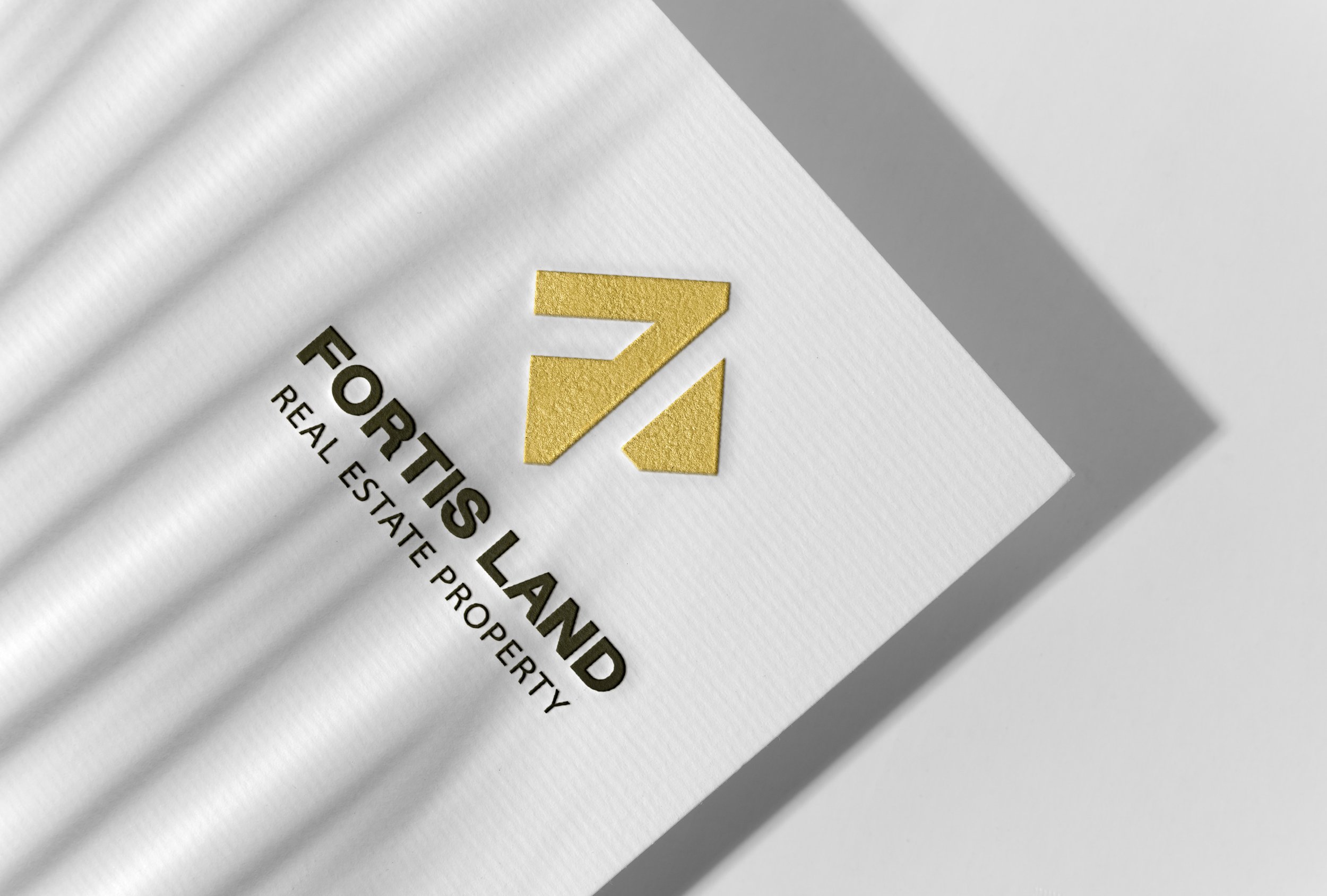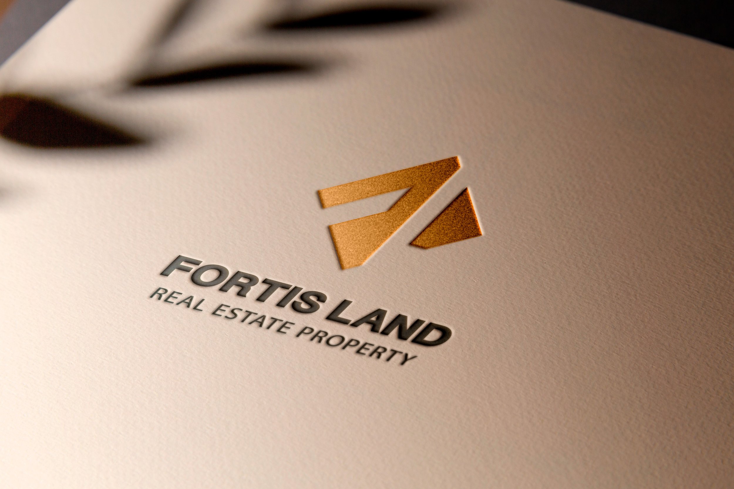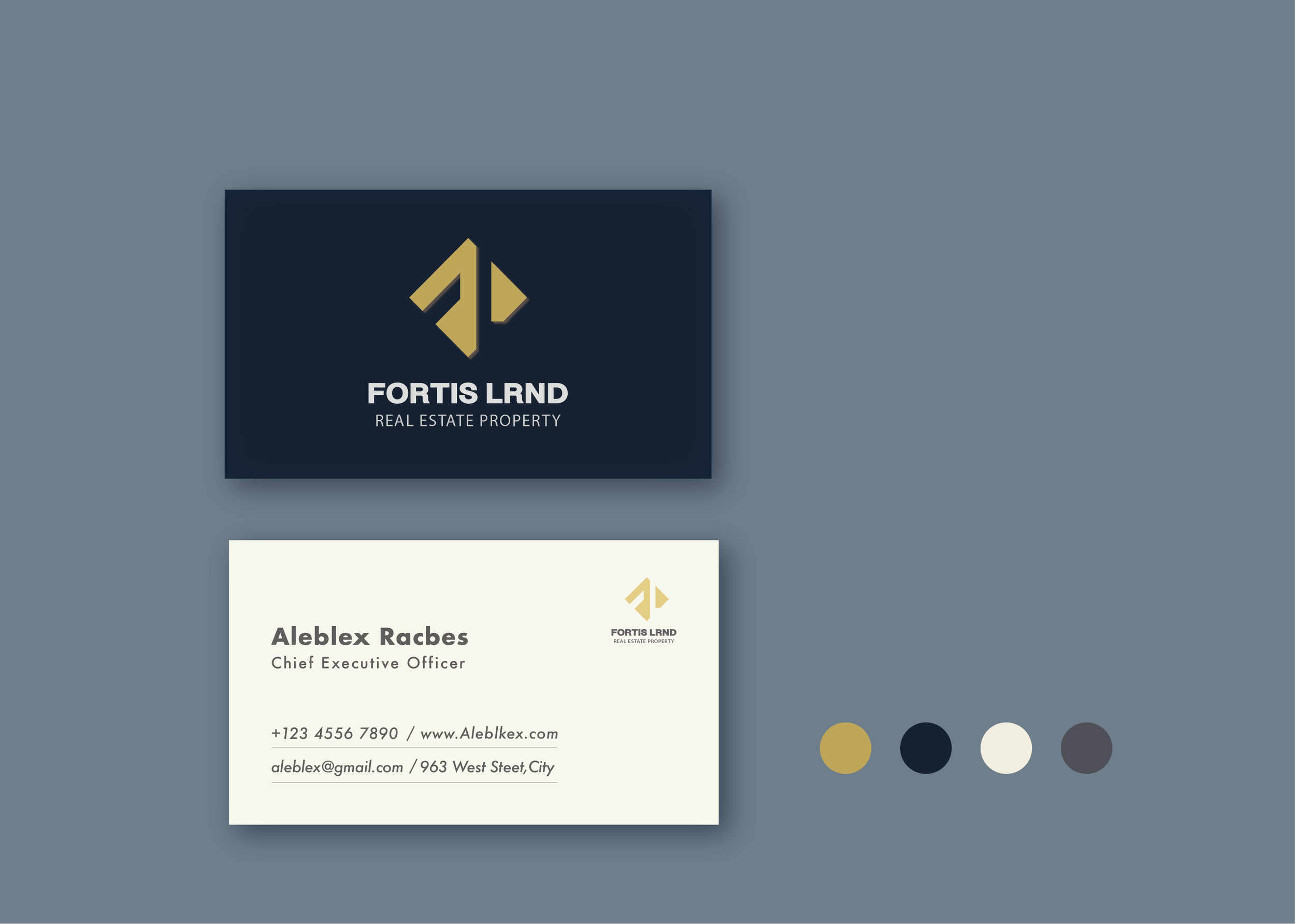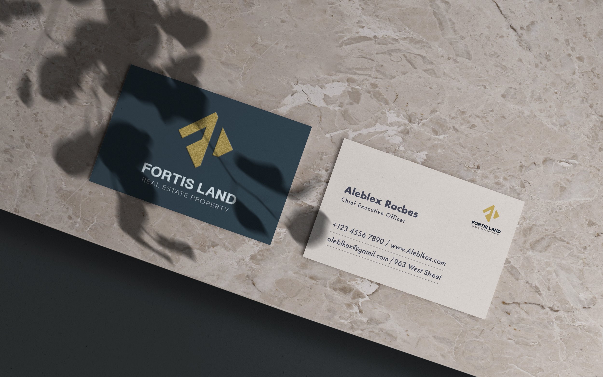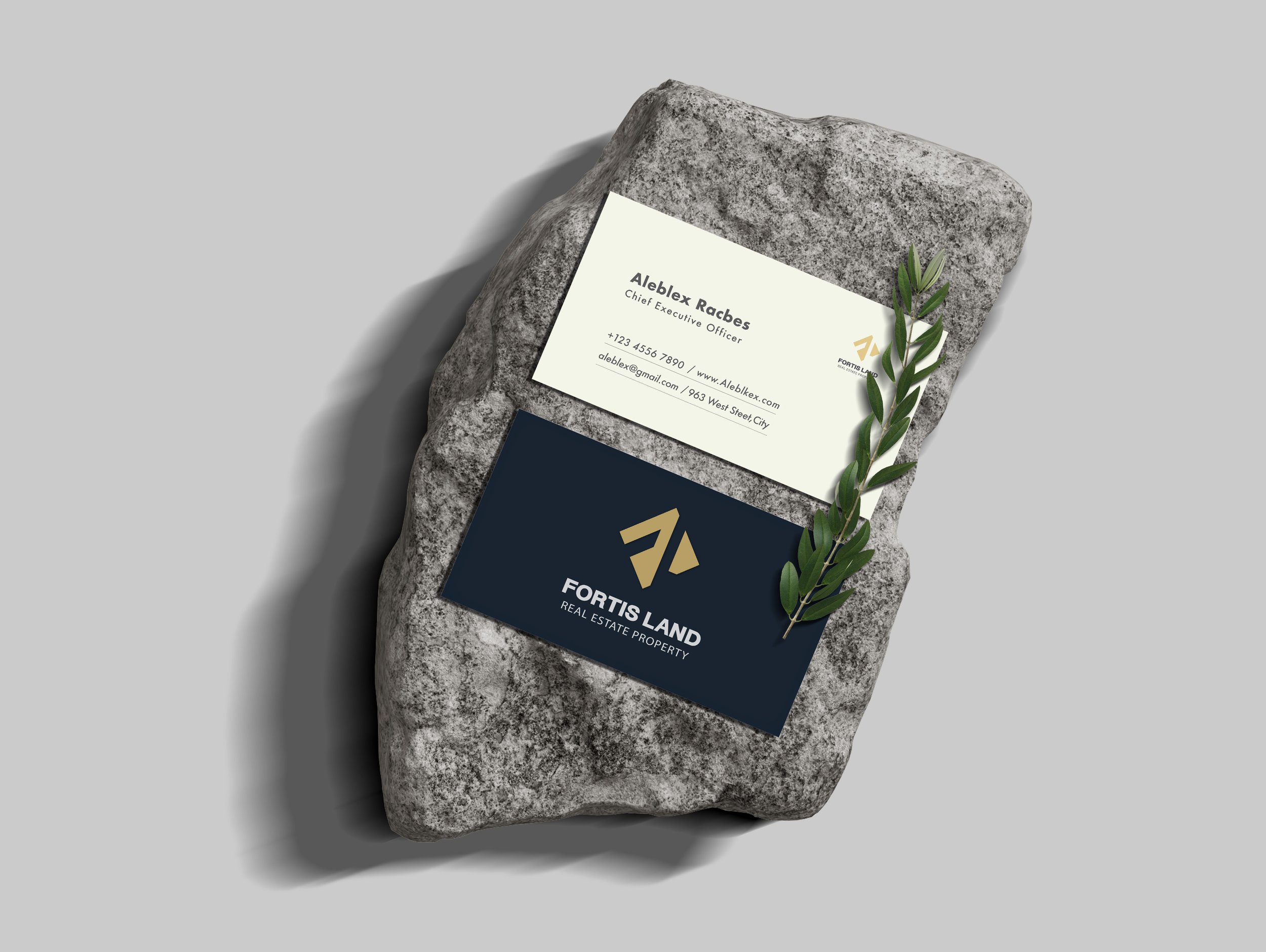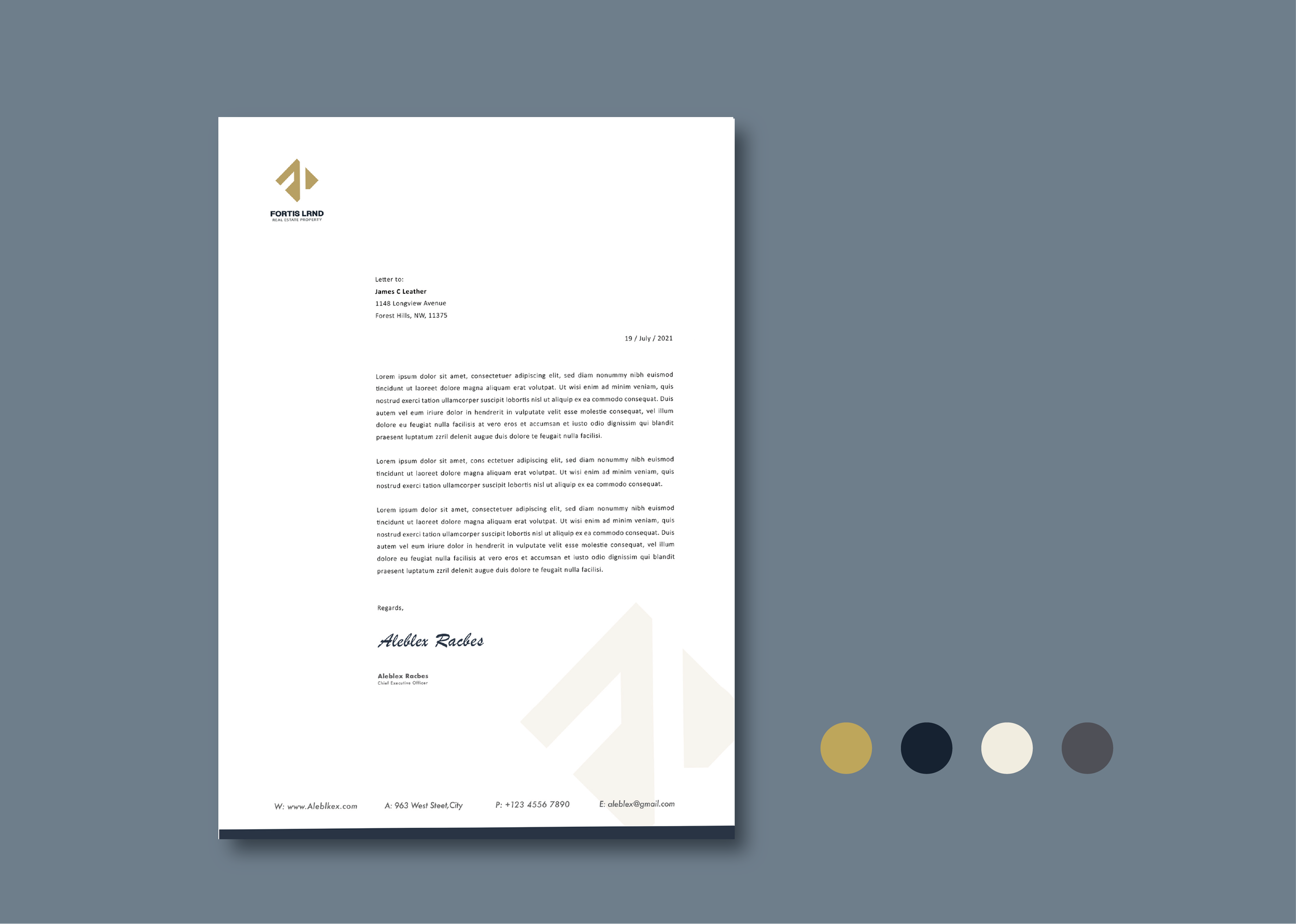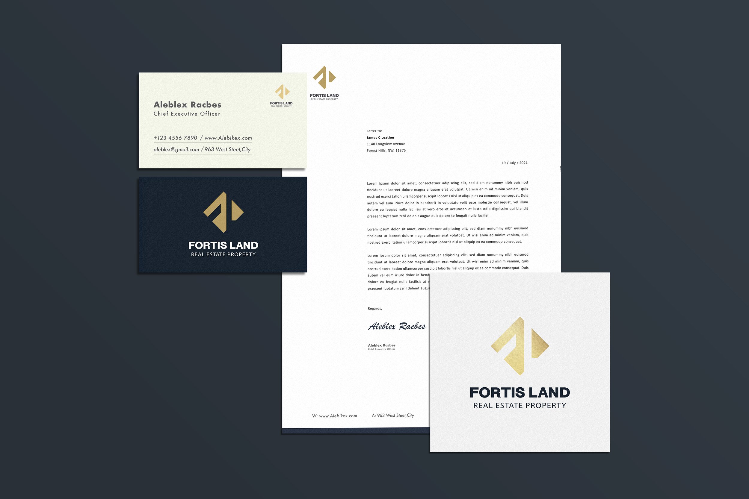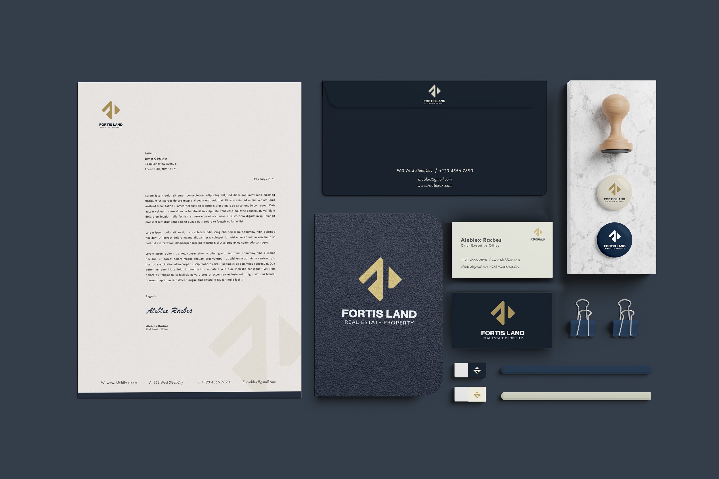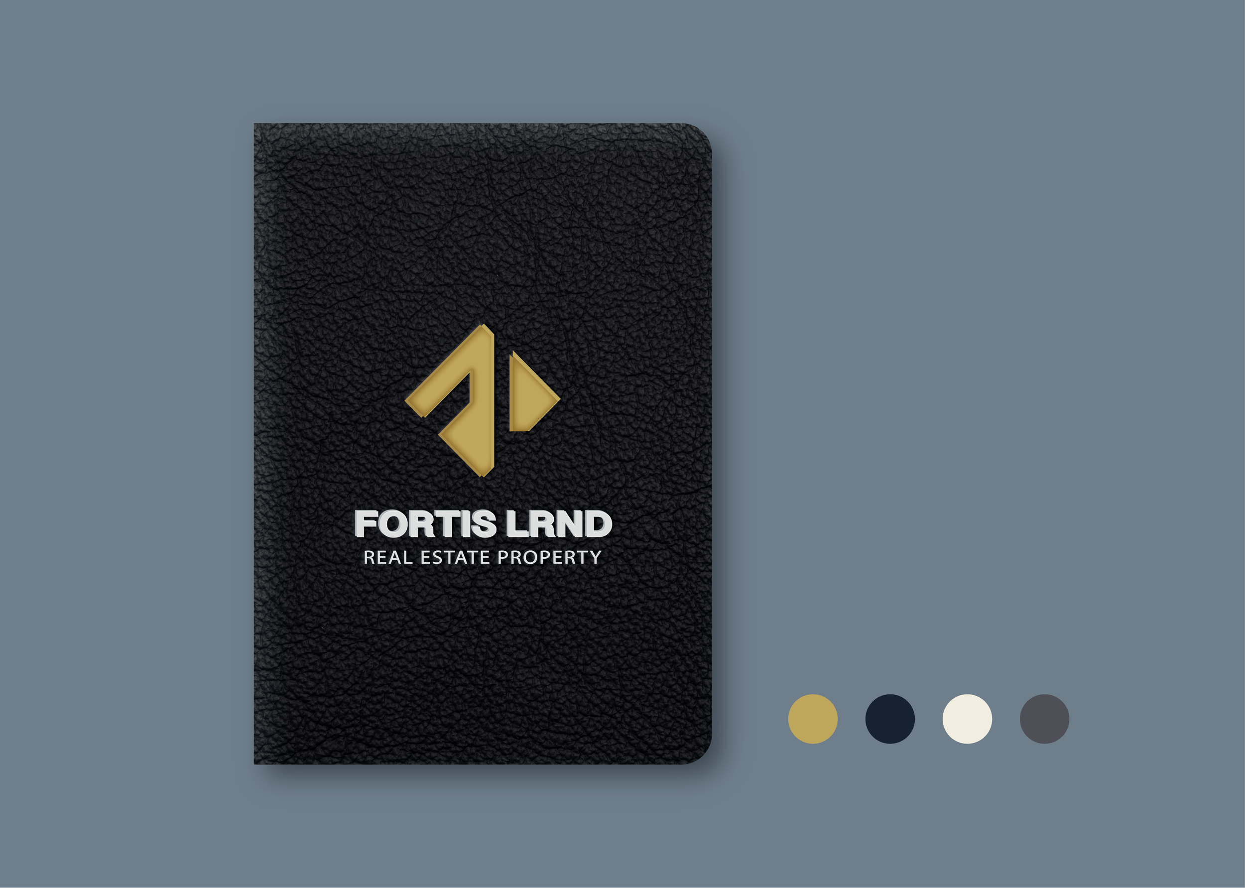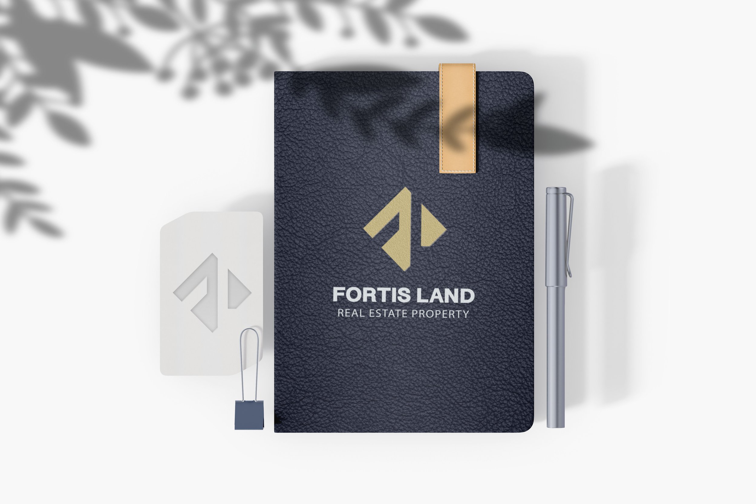
Fortis land
a real estate property company
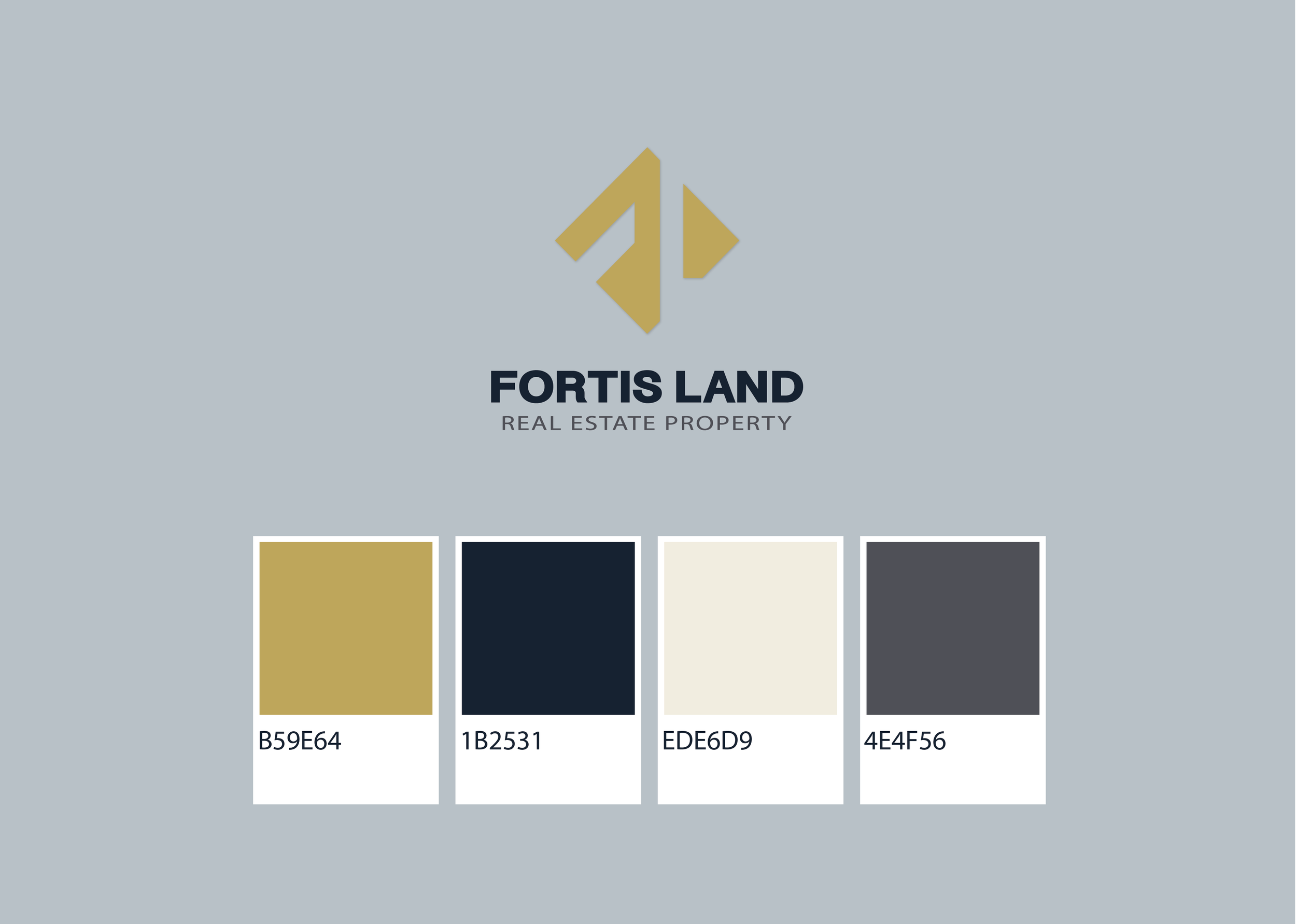
Fortis Land is a branding project, which offers client a new branding system.
Client hopes their Logo to be elegant and prosperous.
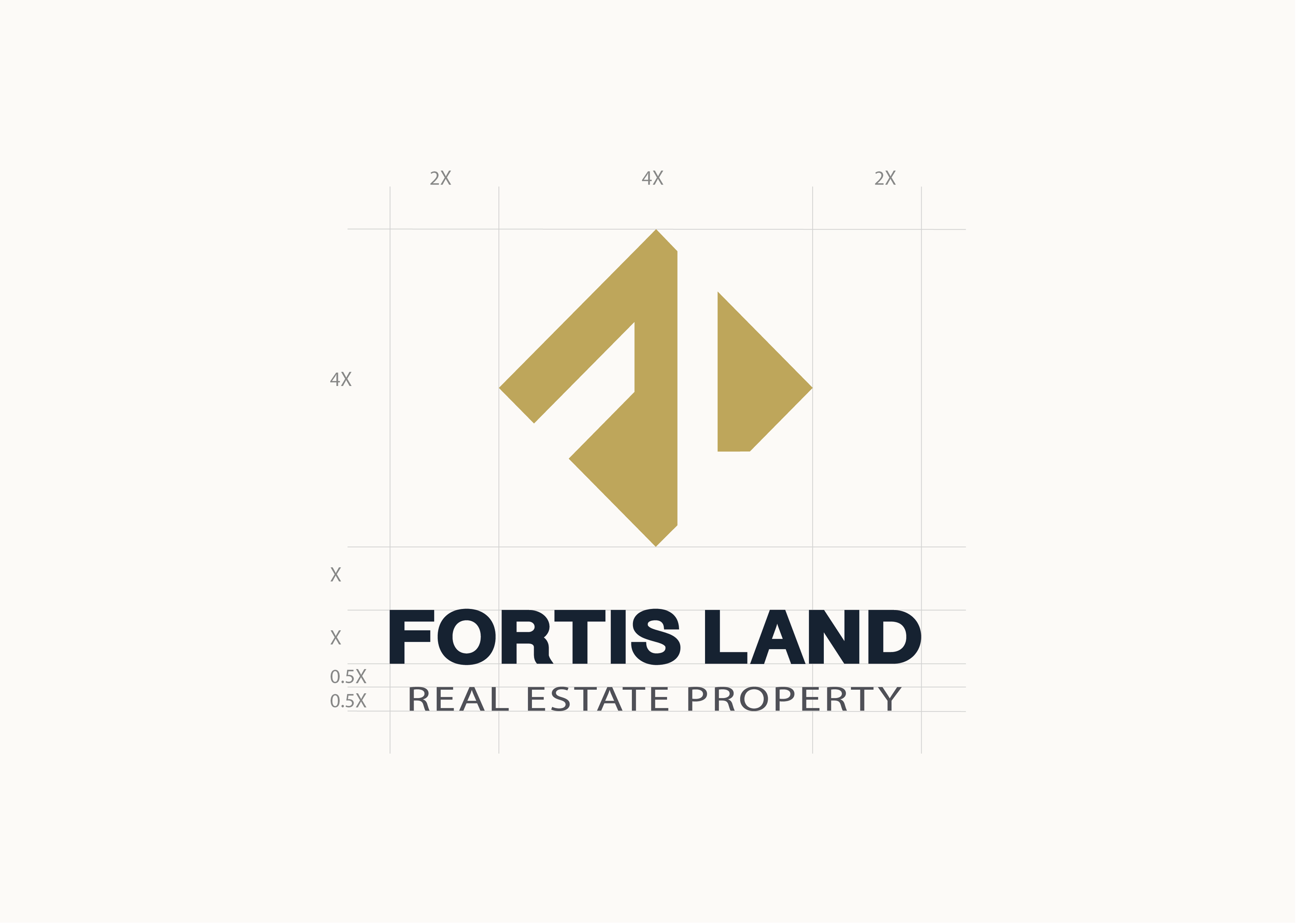
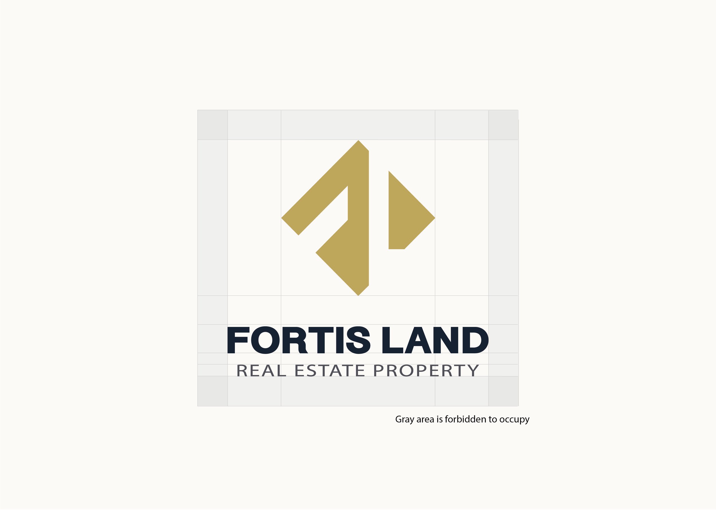
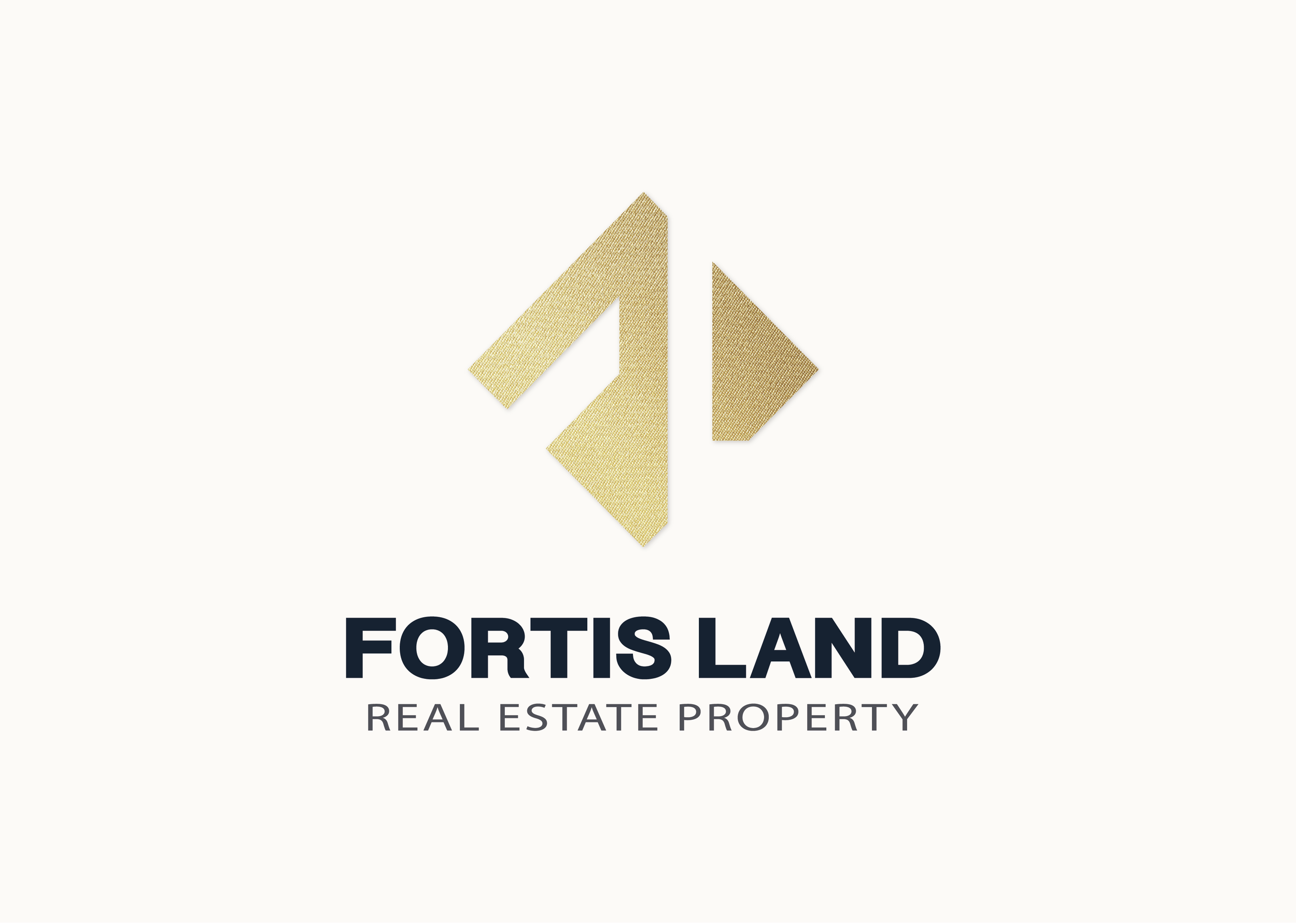
Design is based on two capital letter”F”&”L”, and is designed in a square. Positive space is uesd as logo and in negative space we could see the letter.